$300K loss due to a poor user experience
The Situation
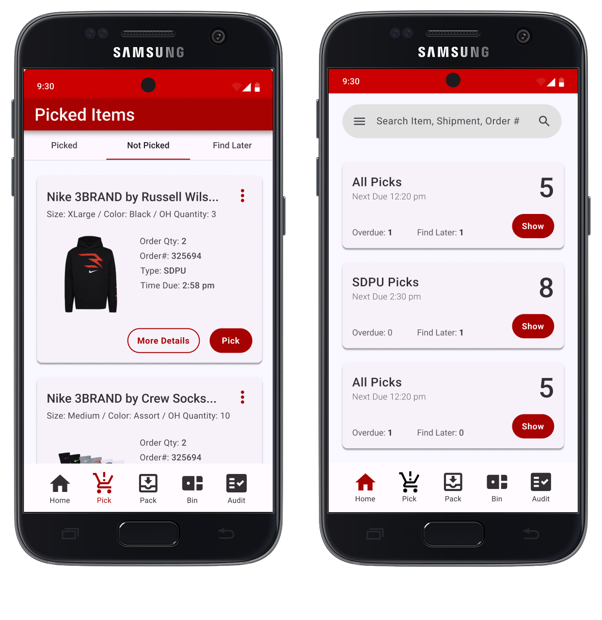
JCPenney store associates use an in-store mobile device to pull products from the floor when customers place an order for pickup or shipping. Most orders carry a hard SLA, giving associates a narrow window to pull, pack, and deliver. During research, a number of issues surfaced — but none more complex than the experience of fulfilling multiple packages within a single order.
The Problem
Associates are often racing against the clock while simultaneously serving customers on the floor — two competing priorities with little room for error.
The Constraints
The constraints were primarily technical. Backend and API modifications were off the table, which meant designing a meaningfully better experience within the boundaries of existing systems and data — a challenge that made the design work harder and more intentional.
Iterations & Failures
01 > Fail
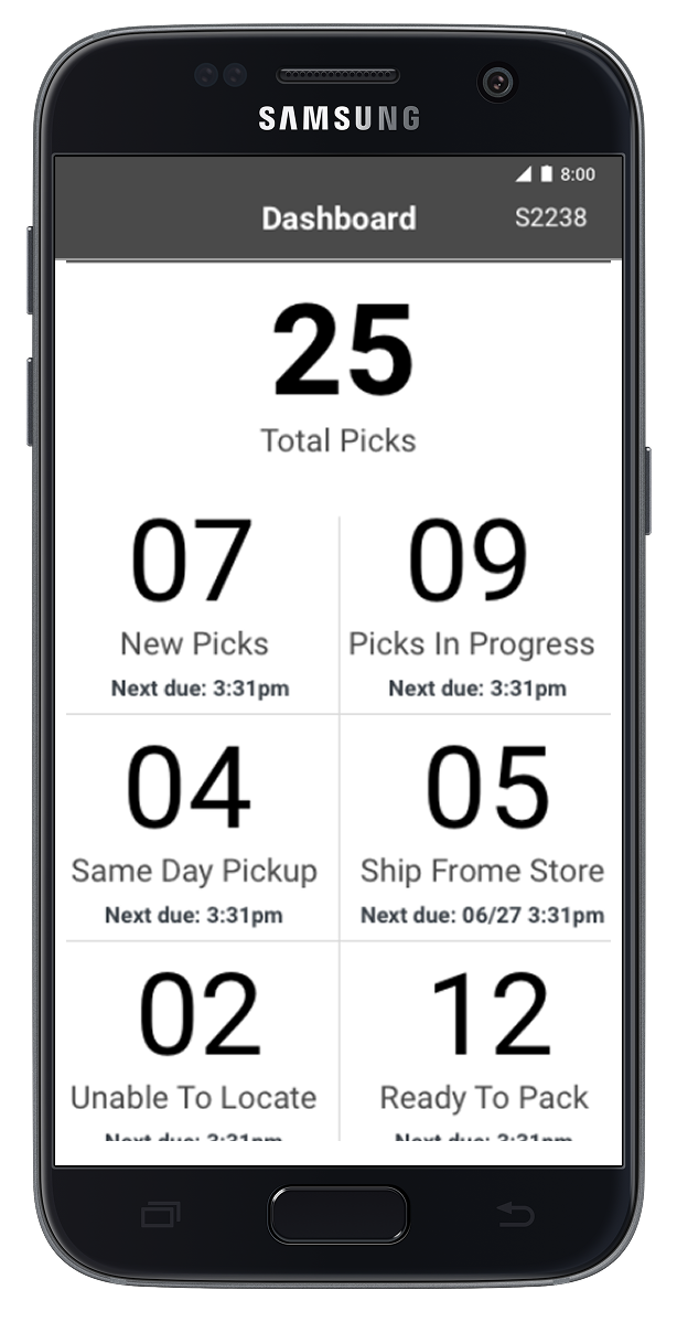
The initial iteration was great for showing a location where all you items were available, but if only some items in your cart were available at a given store the user did not have visibility to which items were or were not available.
02 > Fail
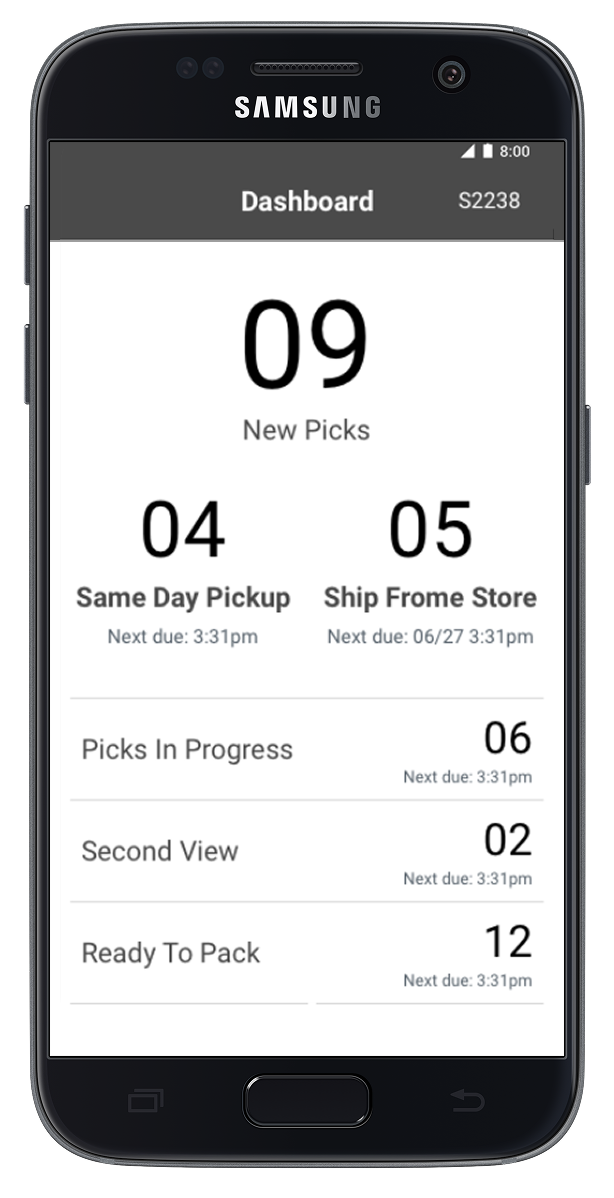
The visual hierarchy was drastically improved for the 2nd iteration. Once users were able to test it out a bit they felt like the prominence of the Same Day Pickup and Ship From Store containers were great for those working the floor but less intuitive for management.
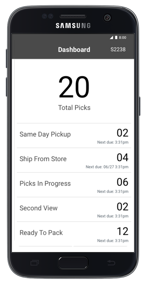
03 > Almost a Winner
The 3rd version was almost perfect for what users expected to see and met 80% or the primary needs. We made a few small tweaks for the final version to ensure there was an obvious call to action and aligned to Material's design system.
Button Label = -$300K Impact
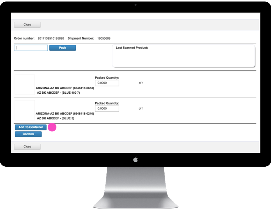
Add To Container
The button label, it turns out, carried a lot of weight. While testing we uncovered a $300K in savings by simply swapping the label. Associates stopped treating it as a signal to be done — and began treating it as the real question: "Which container does this belong in?"
The Solution
Changing one label created clarity. But what sealed it was focusing on the underlying mental model — helping associates think in containers, not just items. That shift in framing made the rest of the workflow almost self-explanatory.
Key Takeaways
50% faster
Observational research indicated that completing tasks in the original flow took on average 50% longer — both when trying the interface for the first time and after basic training. The redesign cut that time in half.
+$300K savings
With around $40 loss per bad interaction, reducing over-picks and mispicks by 60% via clearer labels and workflow alone was worth roughly $300,000 a year. One button label change drove the bulk of that impact.
Training manual not required
While we were redesigning the experience, the stores team was putting together a 75-page training manual. They never used it. The redesign was intuitive enough that most associates were fully onboarded in just 2–3 hours.